Creative Brand Strategy Task 3
04.10.2023 ~ 25.11.2023 ( Week 06 ~ Week 13)
Lum Qian Tong 0344309 Bachelor of Design in Creative Media
Creative Brand Strategy
Task 3/ Campaign Branding
Instruction
I build the knowledge gained in Tasks 1 and 2 in order to create a campaign presentation deck. Students are creating the visual identity and design apps for the suggested campaign using knowledge obtained from prior work; the design approach begins with establishing major main visuals and then adopting them to design applications.
Logo
Like always, we started with design our brand logo 1st. As a street art campaign I need to show people what my campaign is through my logo. So, I design started with some elements like calligraphy styles and combined with spray paints design.
 Figure1.0 The first draft of JBSAS Logo [Week 6]

I have create a logo that screams street art and free expression. I got three cool ideas. One's all about a standout symbol with a more toned-down font. Another's playing with merging 'J and B' into fancy writing. Then, we're thinking of blending the best bits from both to make a logo that really pops. So, still need to improve the logo that shouts out street art and freedom vibes.


Figure1.2 The Second Explore of JBSAS Logo [Week 7]
I experimenting with various typefaces for the wordmark, leaning toward the number 14 but seeking that perfect harmony with the symphony's tone. Exploring the scale to see where it begins adds to the creative journey.


Figure1.3 Comparing the colour [Week 7]
Then for the logo colours choose the one with yellow and another one is orange have been selected and when I show it in the merchandise hat the orange look well so we choose that as final logo colours.

Figure1.4 Explore Symphony in different position [Week 8]
I develop the position of a wordmark symphony. The option I choose is that the word follows the curves is not too bad but the original is better because it shows the balance.
Final Logo


Figure1.5 Final Logo in B&W, Reverse and Colours [Week 9]
Poster
.jpg)

Figure 2.0 1st try Posters [Week 8-9]
Designing the poster poses challenges when my logo and visual style heavily favor street art, potentially causing everything to blend together. To combat this, strategic blocking helps individual elements stand out against textured backgrounds, ensuring logo remains visible. Establishing a clear hierarchy for information is crucial, guiding viewers to focus on key messages. Consistency in typefaces is key to prevent confusion, maintaining a controlled yet artistic communication style, especially in city-wide campaigns. Balancing street art's creative freedom with design discipline ensures the message shines through while maintaining visual clarity.
.jpg)
Figure 2.2 2nd try Posters [Week 9-10]
The main issue with the first poster is the similarity between the logo and the headline, making them blend together. To resolve this, one idea is to emphasize one mark in a corner while letting the logo float elsewhere, using paint splashes to maintain simplicity. Regarding the second poster, the challenge lies in isolating elements amidst a busy composition. There's a need to improve the color balance to prevent it from dominating the overall design while isolating and organizing the components effectively.
Final Poster
.jpg)
.jpg)
Website
.jpg)
.jpg)
Figure 3.0 Website Draft [Week 10]
My logo already finalized, has a dynamic feel on the landing page, almost as if it's painted on the floor amidst graffiti, creating a sense of movement. However, the website seems to lack that same energy, with a more subdued vibe, perhaps due to the anticipation of colorful visuals. Introducing color texture might help bring that liveliness to the website. This addition was suggested to add vibrancy and complement the forthcoming colorful visuals.
.jpg)


Figure 3.2 Website Draft #2 [Week 11]
After the feedback, I want to more play more funky and playful for my website too. Comparing website design #1 to website #2, it seems that website #1 is more straightforward and includes interesting information. The buttons are slightly smaller, offering a streamlined appearance. The focus now shifts to designing the "About Us" page for the upcoming week, while the merchandise page on both websites is satisfactory. It appears that the design of website #1 is preferred for its simplicity and engaging content.
Final Website
.jpg)

Social Media

I having fun and creative for my social media too. I used the movement of paint mix together and sort of liquid. The background design of social media posts is appealing, but there's a need to ensure that the information is easily visible and legible. Some posts might require more space or expansion to accommodate the planned information effectively. Overall, the first and second social media designs seem satisfactory, but a tweak in information expansion might enhance their effectiveness.
Final Social Media
.jpg)
.jpg)
.jpg)
Figure 4.2 Social Media Post 1 [Slide 1-3]
.jpg)
.jpg)
.jpg)
Figure 4.3 Social Media Post 2 [Slide 1-3]
.jpg)
Figure 4.4 Social Media Post 3 [Slide 1]
.jpg)
Figure 4.5 Social Media Post 4 [Slide 1]
.jpg)
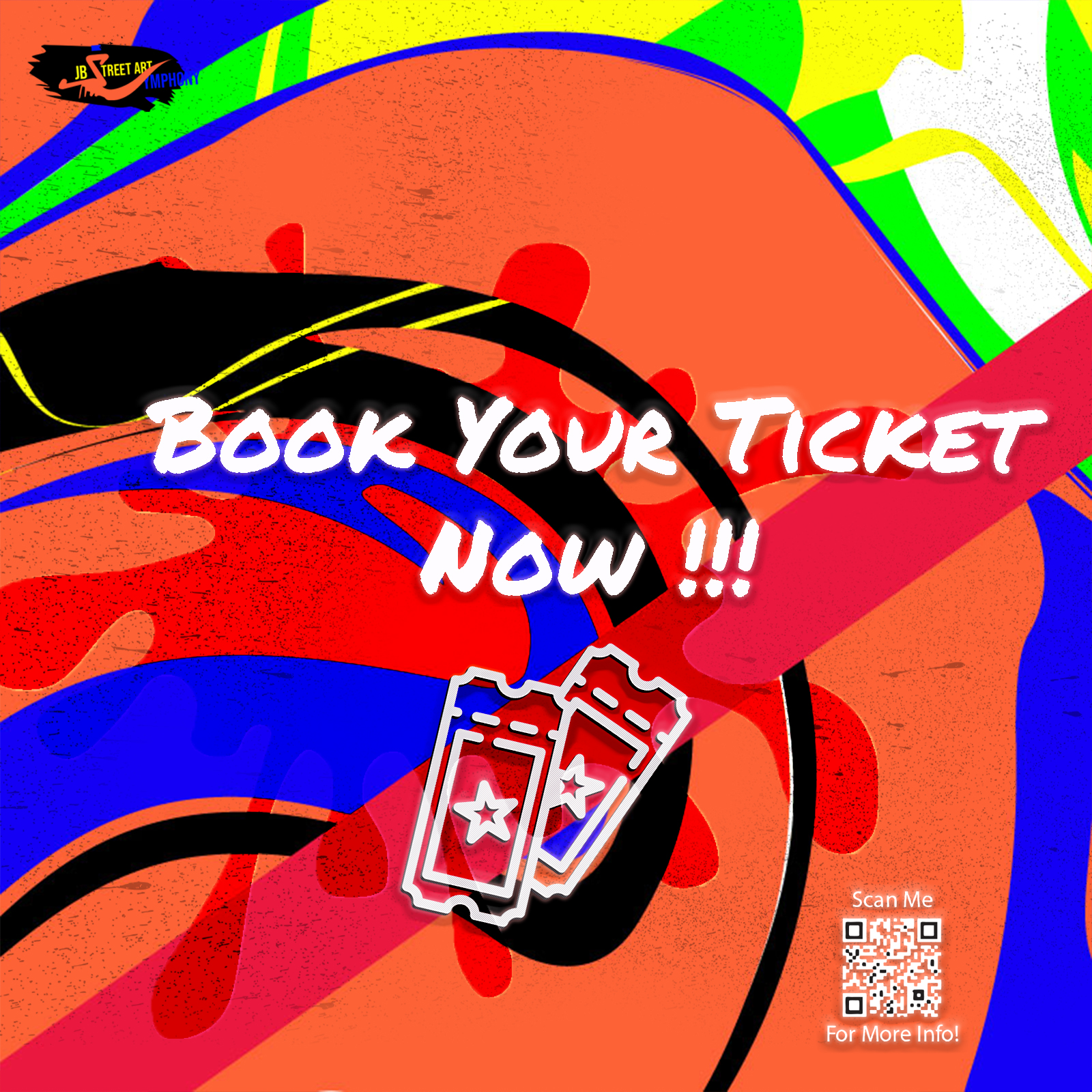
Figure 4.6 Social Media Post 5 [Slide 1-2]
.jpg)
Figure 4.7 Social Media Post 6 [Slide 1]
.jpg)
.jpg)
.jpg)
Figure 4.9 Social Media Post 8 [Slide 1-2]
.jpg)
Figure 4.10 Social Media Post 9 [Slide 1]
Final VideoFigure 5.0 Final Video
For the video it is very different to my reference but I maintain using the street art culture style to make it consistency.
AR & IG Filter
.jpg)
Figure 6.0 Ar Filter Progression
.jpg)
Figure 6.2Ig Filter Progression
Final AR & IG Filter
Figure 6.3 vid Final Ig Filter

Pdf Downloadable Map
Figure 7.0 Final Map
Final Task 03
Reflection
Experience: Navigating through this project has been a learning curve, learning the importance of organization and efficient time management. Encouraging feedback on my early-stage work has provided a motivating push to keep going. Staying professional throughout, especially with the promotion video, has been a key takeaway from this journey.
Observation: This folder setup is a game-changer for me, keeping me in check with deadlines. Even though my projects still have half way to go, the positive vibes push me to keep it professional and keep grinding.
Finding :Got everything sorted neatly in the folder, makes it way easier to handle my time. Shoutout to everyone cheering me on and hyping up my projects, even though my just getting started. Gotta keep it pro for everything
Experience: Navigating through this project has been a learning curve, learning the importance of organization and efficient time management. Encouraging feedback on my early-stage work has provided a motivating push to keep going. Staying professional throughout, especially with the promotion video, has been a key takeaway from this journey.
Observation: This folder setup is a game-changer for me, keeping me in check with deadlines. Even though my projects still have half way to go, the positive vibes push me to keep it professional and keep grinding.


Comments
Post a Comment